

How to Add Loading Skeletons to React App Using Chakra UI


A while ago I was working on a project GamesDrive and built it using React + TypeScript and using Chakra UI. I was required to get information from the API and wait for its response and then process it and show it to the user. If they have a slow network it would take forever to load and that would be a bad user experience. So I thought to add a loading spinner to the site and so I went to Chakra Documentation and saw something called Skeleton loading same as the loading animation on sites like Facebook and Linkedin. I was surprised to learn that you could create that animation using Chakra UI. It took me a while to figure out how to implement it on my website, but eventually, I was able to make it work. The Skeleton loading took my site's user experience to another level.

So here I am writing a blog about it, so you don't have to waste your precious time by searching and reading documentation { I hate it too }. Let's not waste time and begin the tutorial.
Initialize Your React Project
There are multiple ways you can create a react template. There are many tools available to do the same. I am going to use the same tools that I used for the project. So we are going to use React with TypeScript built using Vite.
Creating Template using Vite
what is Vite?
Vite is a build tool that aims to provide a faster and leaner development experience for modern web projects. Vite is different as it was created by Evan You, who also created Vue.js, as a means to simplify and accelerate the build process. Vite leverages native ES modules in the browser to load your code instantly, no matter how large the app is. It also supports hot module replacement for an extremely fast development workflow.
Setup React + TS using Vite
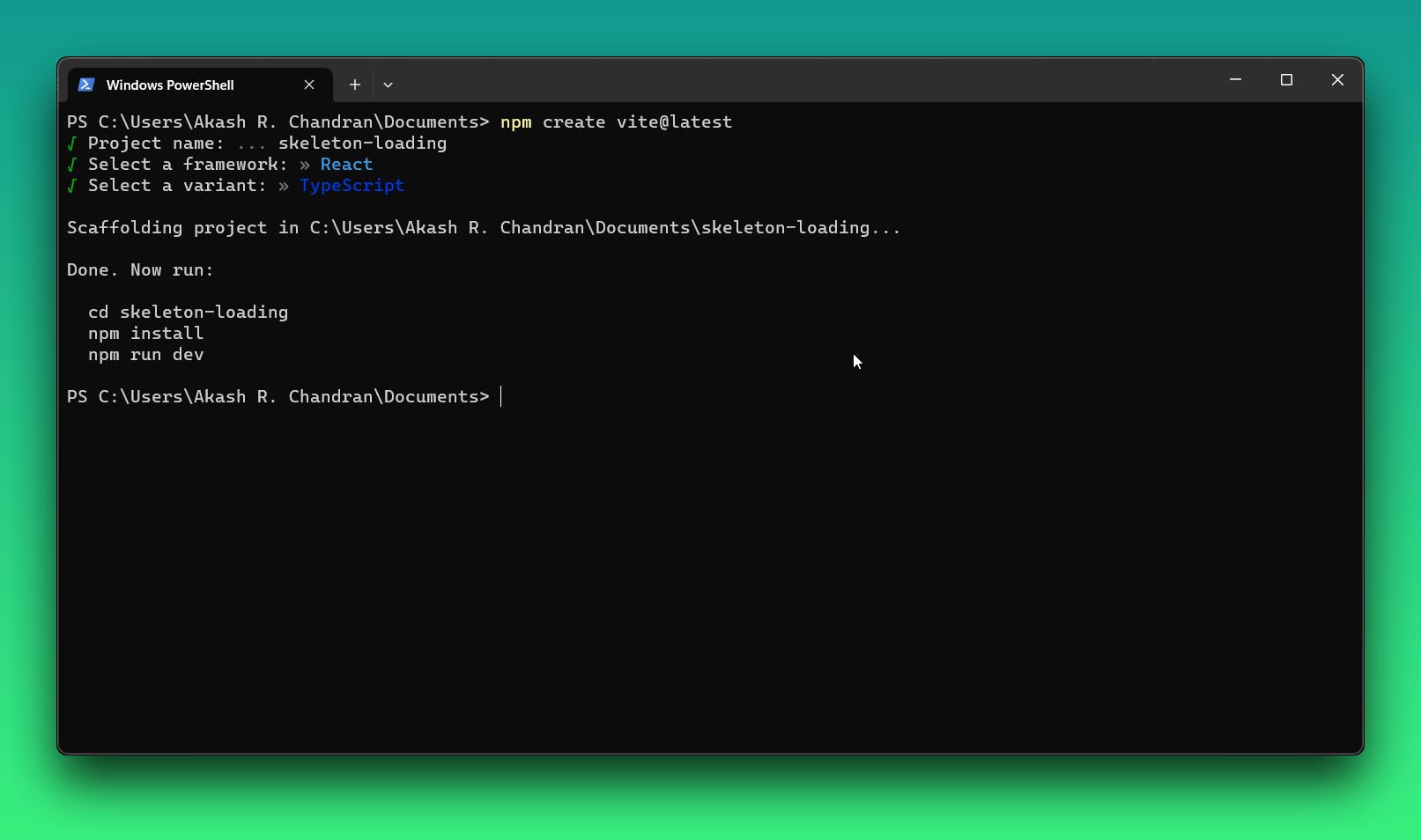
You need to have Node JS version 14.18+, 16+. I will be using NPM as my package manager. To get started open a folder in which you want to set up the project, I am going with Documents folder and paste the command below:
npm create vite@latest
You may be asked to install Vite if you don't have it already just press continue. It will ask for,
Project name: Give it any name you like, I prefer to give
skeleton-loadingas we trying to create skeleton-loading animation here.Framework: Choose React of course.
Variant: For variant choose TypeScript.
Now cd into the folder and install all the required packages. You can use the below commands,
 cd skeleton-loading # change this to your folder name
 npm install
Installing packages may take some, depending mostly on your network speed. After installation, let's run the development server to check if everything is installed correctly. To run the development server use the command below,
npm run dev
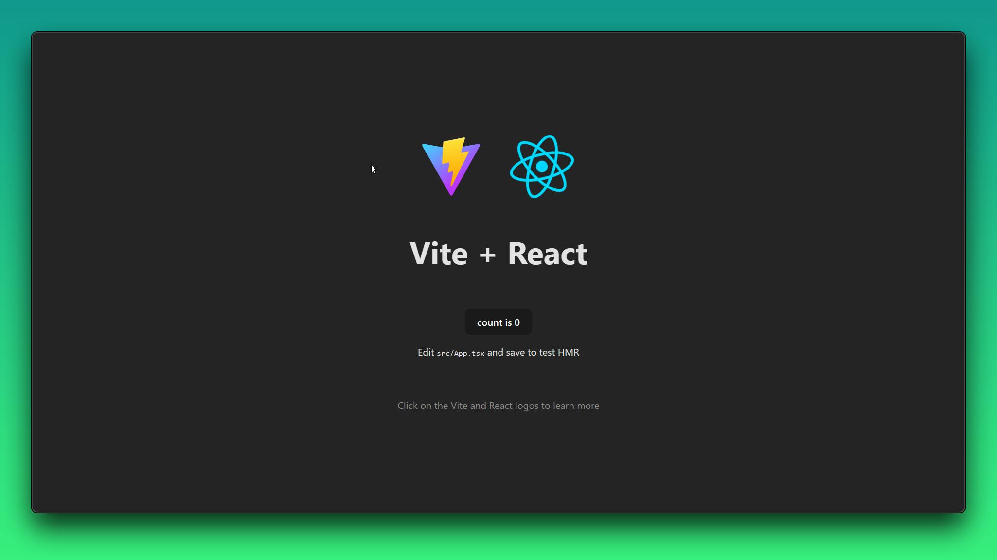
So we have successfully set up React and Vite, and now we have to install Chakra UI.
Installing Chakra UI
They have a dedicated section in their documentation dealing installation of Chakra UI specifically for Vite, you can read it here. As per the docs installation command is,
npm i @chakra-ui/react @emotion/react @emotion/styled framer-motion
After installation open the project in your Favourite IDE, I am going with VS Code. And find main.tsx file, you can use Ctrl + P to search file in vs code.
And then wrap the App component with the ChakraProvider component. You have to import ChakraProvider component from the import { ChakraProvider } from '@chakra-ui/react'. The main.tsx file would look like this,
import React from "react";
import ReactDOM from "react-dom/client";
import { ChakraProvider } from "@chakra-ui/react";
import App from "./App.tsx";
import "./index.css";

ReactDOM.createRoot(document.getElementById("root") as HTMLElement).render(
  <React.StrictMode>
    <ChakraProvider>
      <App />
    </ChakraProvider>
  </React.StrictMode>
);
You can delete the code inside the files index.css and App.css and also remove their import from the files main.tsx and App.tsx. As these styles may interfere with the styles provided by Chakra UI, so it's better to remove them.
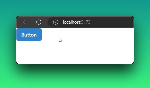
Now setup for our Chakra UI is complete. To verify if our setup is complete we can try something like placing a button on our website. Go to App.tsx and remove all the code inside the App function or paste the below code after removing the entire code.
import { Button } from '@chakra-ui/react'

function App() {
  return (
    <Button colorScheme='blue'>Button</Button>
  )
}
export default App
Then start the development server using npm run dev command. And you should see something like this on the webpage.
Let's start building!
We don't want to build much of a UI, we just need to learn how to use the skeleton loading animation. This is pretty easy actually, so we directly make it. In Chakra UI, three types of skeleton components can be used to display loading states:
Skeleton: The
Skeletoncomponent is the basic skeleton component in Chakra UI. It is used to create a loading placeholder for the content. It takes the height as a prop and displays a rectangular skeleton with the specified height. This component is useful when you want to display loading placeholders for multiple items or lines of text.Example usage:
<Stack>
<Skeleton height="20px"/>
<Skeleton height="20px"/>
</Stack>
- SkeletonCircle: The
SkeletonCirclecomponent is used to create a circular loading placeholder. It takes the size props to specify the diameter of the circle. This component is often used to display loading placeholders for avatar images or circular icons. Example usage:
<Box padding='6' boxShadow='lg' bg='white'>
  <SkeletonCircle size='10' />
  <SkeletonText mt='4' noOfLines={4} spacing='4' skeletonHeight='2' />
</Box>
- SkeletonText: The
SkeletonTextcomponent is used to create a loading placeholder for text content. It takes props such asmt(margin-top),noOfLines(number of lines),spacing(line spacing), andskeletonHeightto define the appearance of the loading text. This component is useful when you want to display loading placeholders for paragraphs or blocks of text.
Example usage:
<SkeletonText mt='4' noOfLines={4} spacing='4' skeletonHeight='2' />
Now we know all the skeleton animation components provided by the Chakra UI. Now let's try to make an animation for a card with an image and text below it.
Building a skeleton loading card
Firstly we start building cards with the card component provided by Chakra UI. I like to create a folder called component in which all components used will be present. There is no square image skeleton component provided by Chakra, so we have to use the Skeleton component and give it some height.
Let's create a file called SkeletonCard.tsx and return a card with Skeleton and SkeletonText components nested inside. The main thing is trying to recreate the component to which you want to apply to load using these 3 components. My SkeletonCard.tsx file looks like this,
import { Card, CardBody, Skeleton, SkeletonText } from "@chakra-ui/react"

const SkeletonCard = () => {
  return (
    <Card>
    <Skeleton height="200px" />
    <CardBody>
      <SkeletonText />
    </CardBody>
  </Card>
  )
}
export default SkeletonCard;
We have adjusted the height to ensure that it appears larger than the width, giving it the appearance of an image. Now we have to open App.tsx file and import this component.
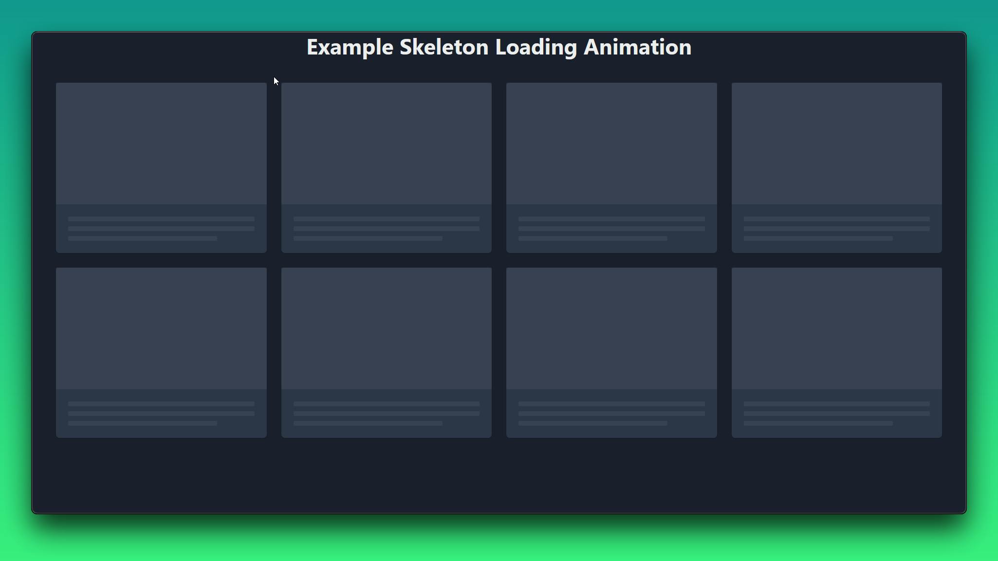
In App.tsx file we can return a grid with a template attribute of {base: `"nav" "main"`}. I have added a navbar just for the heading Example Skeleton Loading Animation. You can remove it if you want to, if you do then change the template. We have to make a Grid component to define the template areas.
We need eight cards therefore we will be using an array called skeletons with 8 elements. And we map each element to a Skeleton card, you can set the array elements as key. The code in App.tsx looks like,
import { Grid, GridItem, Heading, SimpleGrid } from "@chakra-ui/react";
import SkeletonCard from "./components/SkeletonCard";

function App() {
  const skeletons = [1, 2, 3, 4, 5, 6, 7, 8];
  return (
    <Grid
      templateAreas={{
        base: `"nav" "main"`,
      }}
    >
      <GridItem area="nav" justifySelf="center">
        <Heading>Example Skeleton Loading Animation</Heading>
      </GridItem>
      <GridItem>
        <SimpleGrid columns={4} padding={10} spacing={6}>
          {skeletons.map((skeleton) => (
            <SkeletonCard key={skeleton} />
          ))}
        </SimpleGrid>
      </GridItem>
    </Grid>
  );
}

export default App;
Thus we have successfully implemented a skeleton animation using Chakra UI. This is that easy to do. To check the result you can use the development server. To do that just run npm run dev. And you should be able to see the result.
We have implemented only the animation, it's the best case when you're trying to fetch data from an API or database so the user has to wait for a while, so you can use this animation to increase the user experience. You can use the documentation of Chakra to know more examples and use cases.
Conclusion
We have completed implementing the skeleton loading animation on our website using Chakra UI. There are more libraries out there which can implement skeleton loading and you may be interested in them, so I have mentioned some below.
There may be more I could only find them. User Experience is a crucial so using skeleton animations can give you a plus point atleast it did for me. Thank you for reading patiently and do follow me on social media.